Designing your scene

 
Works of art tell a story or evoke an emotion. When planning a scene, ask yourself "What am I trying to communicate?"

The many elements in a scene design work together to create ambiance and tell your story. I call them layers because like a wedding cake, each layer is distinct but integral to the whole, and if you leave out too many, your cake is pretty flat. Starting with the broadest (first layer) and working toward the most specific (the icing?):

    Location: Climate, season, city/country, lakeside/seaside/desert--shown through landscaping, views through windows, and reinforced through all the other layers.

    Architectural Era: Victorian, Tudor, Bauhaus, Gothic--this sets the earliest possible date for your scene and often suggests a location as well.

    Architectural Style: cottage, farmhouse, townhouse, mansion, tract home, apartment each have their own elements of style.

    Building Materials/resources: gleaming marble and splintered wood say two very different things about a house.

    Condition: pristine new, lived in, shabby, decrepit

    Atmosphere:  warm and cozy, cool and elegant, spooky

    Colors: Briefly, cool colors like blue and green are calming; warm colors like red, yellow, and orange are lively and stimulating. The bright primary hues of red, yellow, and blue are simple and childlike, while subdued colors are more sophisticated. Dark colors low in the room (flooring, low furniture) tend to make the room more solid and "grounded." Dark colors suspended high in a light colored room (ceiling, pictures) seem disconnected and floating. Read more about color basics and color psychology.

    Texture: Smooth, shiny surfaces like marble, satin, gleaming wood, and mink evoke wealth and formality; rough, shaggy, matte textures like stucco, burlap, and fleece are more casual. 

    Line: Horizontal lines (like low couches and wainscoting) are restful and calm--but use too much of this and your room can fall asleep. Vertical lines (tall windows and furniture, contrasting trim around doors) are more alert, but can still be very formal. Lots of tall, skinny elements might make your room seem uptight. Diagonal lines are lively and casual; too many diagonals can make a room chaotic and disturbing. Curves are romantic and sensual but can lack definition. Use a variety of lines, heights and shapes in the room to give it life. And remember repetition; just one rounded element might seem out of place, but an arched door, round mirror, and oval rug can echo each other to give a sense of continuity. 
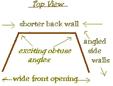
And on a related note, let me just say Boxes Are Boring. Rectangles are static and can be difficult to decorate. Try designing your next room to open toward the viewer by making the back wall shorter than the front wall, like the sketch.  This theatrical scene designer's trick gives a sense of depth and drama, drawing the viewer into the room. It also displays the side walls so every part of your design is visible and working for you. If you're using a pre-made box, you can insert false side walls, leaving a triangular space between inner and outer walls. Put a window in the inner wall, and a scene on the inside of the outer wall to create a view with depth. Add a light between the walls and above the window to illuminate the view. If you've got to stick with a rectangular box, alter or disguise at least one rear corner with a fireplace, tall cabinet, window, door, drape, pillar, built-in corner unit, sculpture, or other tall item.
    Balance: Symmetrical rooms are formal, calm, dignified. Achieve this look by centering a main element in the room and balancing similar items on the sides--for instance, a fireplace centered on the back wall, with a chair on either side. The side items don't have to be identical, but should have approximately equal weight and interest. Asymmetrical rooms are casual, warm, lively. Place a main element off to one side, and orient the other elements toward that one. A corner fireplace faced by a cozy chair is a good example.

    Décor: wall, floor, and window coverings; paint, wallpaper, paneling? Wall-to-wall shag carpeting or a tile floor? Gingham curtains or velvet drapes? This helps to identify the type of room (living room, kitchen) as well as giving clues about date, location, and personality of the inhabitant.

    Furnishings: should clearly identify the type of room, and give more clues about date, location, and personality of the inhabitant.

    Accessories: artwork, books/magazines, bric-a-brac, knick-knacks, and chatchkas that tell you every thing you need to know about the inhabitant and the world in which s/he lives, including clues to age, hobbies, sloppiness, taste

    Repetition: Use repeating colors and motifs to add interest to your rooms. Use little bits of a striking accent color (persimmon, perhaps), distinctive shape (polka dots?), or motif (bears, roses) several times in the room. Odd numbered repetitions work best (lively and asymmetrical), especially 3 or 5--too many repetitions are redundant and clutter the scene. The repeating motifs don't have to be identical; a vase of roses, a painting of roses, and roses in the carpet design reinforce each other.

    Inhabitants: If you include dolls, make sure they represent the people for whom you've created the room, and they're of quality similar to the rest of the room. 

 
EXERCISE 1

Think about a scene you'd like to design; a kitchen, for instance. What is it you want your kitchen to tell us? That families coming together is a nice idea? The center of the home? Cold, stark, useless remnants of an outdated culture? Think about the kitchen you want to do and write down all the things you think about, even if they don't seem related or they contradict one another. Just keep writing, don't go back and change anything yet.

I closed my eyes and typed as I thought about a kitchen; my list was: Stove, warm, window, curtains, clean, 1930s, gingham, wood table and chairs, freestanding cabinets/hutch, towels, food--veggies/fruit, '30s enamel green, cream, black accents, country, farm, gas, layers of flat paint built up over wood and chipped, linoleum floor, light colors, simple colors. Bits of red. Slightly battered/shabby, chipped enamel pots. Light and airy. Cool. Enameled stove Sheer white curtains blowing at the window. Casement window with chipping white paint.
You can tell the room both changed and became clearer in my mind as I looked for details. Now organize your list using the "Layers" categories; some things will go in more than one category, and some categories may remain empty. Mine works out like this: Location: country, farm

Era: 1930s

Style: farmhouse

Building materials/resources: wood, linoleum, gingham, layers of paint built up over wood

Condition: cool, warm, clean, gas, slightly battered/shabby, chipped enamel pots, curtains blowing at the window, chipping white paint

Atmosphere:  light and airy

Colors: light, simple colors. white, cream, '30s enamel green, black accents, tiny red accents

Texture: smooth enamel, flat paint, chipping paint

Line: I see almost equal amounts of horizontal and vertical lines, accented by curved lines in the stove and pots, and by the soft curves and diagonal line of the blowing curtain.

Balance: asymmetrical (I see the window over on the left, and the stove off-center)

Décor: linoleum, gingham, sheer white curtains, casement window with chipping white paint.

Furnishings: enameled stove, wood table and chairs, freestanding cabinets/hutch, not built-ins,

Accessories: towels, food--veggies, fruit, enamel pots

Repetition: bits of red and black accents

Inhabitants: don't seem to have any

You can add or delete things from your list as your ideas evolve. I believe I'll go with cool instead of warm, and woodstove instead of gas. Now I'm thinking this is a kitchen in a house abandoned during the Dustbowl, the American drought of the 1930s. The inhabitants took what they could carry, and left the rest.  Now I've got a story to tell, and a plan to tell it in a compelling way.

 
I decided to try this technique on a doll project. With a few category changes, the plot for my Musketeer doll looks like this:
Location: Paris, France, city, Tudor house, inn yard, stable yard, courtyard, alley, arched doorway
Era: 17th century
Atmosphere: panache, honor, courage, pride, all for one…, comrade, defend, flamboyant, secrets, danger, intrigue, plotting, good vs. evil, dark vs. darker, captain hook, pirate, royalty, cardinal
Materials/resources: plumes, lace, leather, tabard, stone, jewels, wood, satins, lace, cobblestones, gray stone, heavy planks, iron hardware
Condition: used hard, worn, broken-in, but well cared for. Supple.
Colors: black, silver, white, gray stone, dark, dark vs. darker
Texture: stone, lace, leather, satin, wood, cobbles, planks, iron
Line: arched door, plumes, sword, curly hair, cobbles, planks, stones, torch
Balance: asymmetrical
Props/Accessories: hat, plumes, sword, boots, horse, tabard, earring, jewels, bucket, nuns, iron hinges and latch, gauntlet, torch,
Repetition: black, stones, darkness
Inhabitants: Musketeer (opponent implied)
Clothing: hat, plumes, sword, boots, tabard, earring, jewels, gauntlet, leather, lace, satin, scabbard, cape, baldrick
Headwear: hat, plumes
Footwear: boots
Hairstyle: long, curly; goatee and moustache
Action: duel, fight, ride, dueling in a courtyard
cool! this took me from the idea of making a doll into a story and a scene surrounding the doll.  To see how the doll and his scene are  progressing, visit The Making of a Musketeer.
 
EXERCISE 2

Get a decorating magazine like House Beautiful or Architectural Digest. Use the "layers" categories to analyze pictures from articles and ads (advertisers are really good at telling stories). What is the story behind the picture? What can you tell about who lives there? Do you think their story is told effectively? How would you change the setting to be more effective? What ideas can you use from those pictures to make your designs more effective?

Try this exercise with a miniatures magazine, on scenes you see in a show, or those of your club members. You might want to keep your comments to yourself, though--hardly anybody likes hearing, "Hey, see what you did wrong?"  Just share this article with them!

EXERCISE 3

Again using "layers," design a chair for Santa Claus. It should be so obviously his chair that you would be surprised to see anyone else sitting in it. Picture it clearly in your mind, sketch it, write down a description, or even build it if you like.

Now start over and design the chair without using any shade of red or green, but still making it obviously Santa's chair. What shapes and symbols could you incorporate that scream "Santa!" even without the classic colors? And what colors will you use?

This kind of exercise helps you to see beyond the obvious clichés and into richer images--you can always put the red and green back in later if you like. Adapt the exercise to help you in your next project--maybe designing a bedroom without the bed or a toyshop without toys--kind of Zen, huh?


HOME